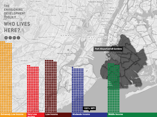
The Center for Urban Pedagogy (CUP) is a non-profit organization that seeks to improve civic engagement through art and design. Their projects “demystify complex policy and planning issues that impact on our neighborhoods, so more people can better advocate for their own community needs”. The project Envisioning Development: What is Affordable Housing? brings an exciting injection of urgency to the task. As the world changes, citizens are taking responsibility for the important subjects in society. That’s new, and it will change everything.
The idea of “affordable housing” may seem mundane, but it can have a number of different meanings depending on where you place yourself on the social ladder. The CUP has created an interactive workshop which argues that the only really important question to ask when building housing is – “affordable for whom?”. The workshop encourages citizens to make use of the data to become the informed voice of reason, and to evangelize their fellow citizens and elected officials.
Click here to view the embedded video.
Mobile data
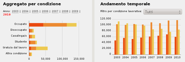
One of Europe’s cultural gems this week reopened their open data portal. After a low key launch last October, the city of Florence relaunched itself by adding 180 small data sets with a CC-BY license, and boosting its geodata section to facilitate the easy creation of maps. They’ve also made a start on publishing the whole deal on Linked Open Data, evidence that they’re not kidding about with the project.
This Florentine effort should help Italy climb up the PSI (Public Sector Information) rankings, developed by the European platform of the same name. This ranking, still in its beta version, is “a tool to measure the level of open data and the reuse of public data across Europe”. It’s a fun, unpretentious idea, and has two particular advantages. First, the project is based entirely on the principle of crowdsourcing – the EPSI made use of local open data specialists to cover initiatives in each country. In return, all the data collected will be given back to the communities when the rankings exit their beta phase, which will be soon. Secondly, it uses the newly created platform for data visualization infogr.am.
The State of Flux
Le Poste, the French postal service, loves open data. With its unique grid, the continuous flow of material it handles daily, and its amazing network that relays information constantly, it has a sacred data resource to exploit. Which is exactly what it has done in partnering with the faberNovel laboratory. Based on “Le Poste’s anonymized records of changes of address”, they’ve created a dynamic visualization of the “movement of families to and from the Bouches-du-Rhône region of France” in 2009. In green is where they’ve come from, and in red is where they’ve gone. The project, entitled Flux2, is simply beautiful to watch.
Click here to view the embedded video.
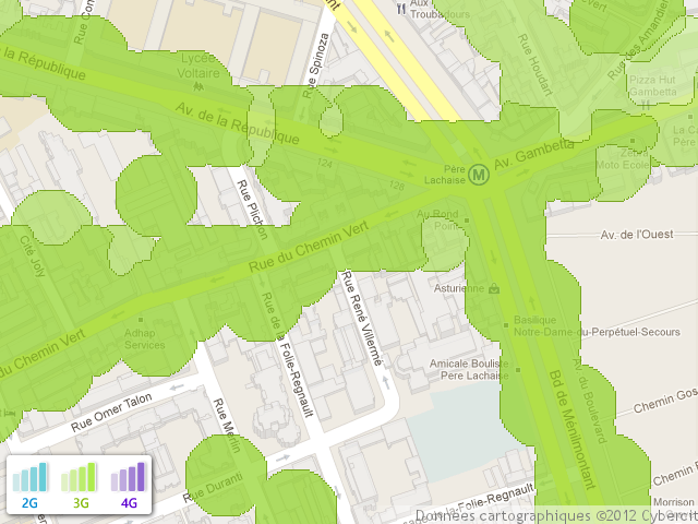
Since we’re on the topic of (tele-)communications, let’s also say a quick word about the interesting initiative Sensor.ly. It “develops products and services to help operators improve their network quality” with the help of a community of testers who record daily “coverage presence and signal strength for their devices.” Granted the project will need to expand their community of testers if it wants to gain in scope and credibility. In any event, it’s a good idea and we look forward to seeing how it evolves, and how operators – who don’t always have much in the way of humor when it comes to publicly identifying the quality of their service – will approach an issue which effects the vast majority of people.
DataLife
Meanwhile, the Swiss project Ville Vivante (The Living City) enthusiastically (re)traces the constant circulation of telephones within the city of Geneva.
Click here to view the embedded video.
Et finalement, a short concerto from J.S. Bach and the talent of Stephen Malinowski to wish you all a wonderful week!
Click here to view the embedded video.
Find previous editions of The Week In Data on Owni.eu
Follow OWNI’s elite data squadron on Twitter: @pdatha, @gregoirenormand, @mariecoussin, @juliengoetz & @nicolaspatte


